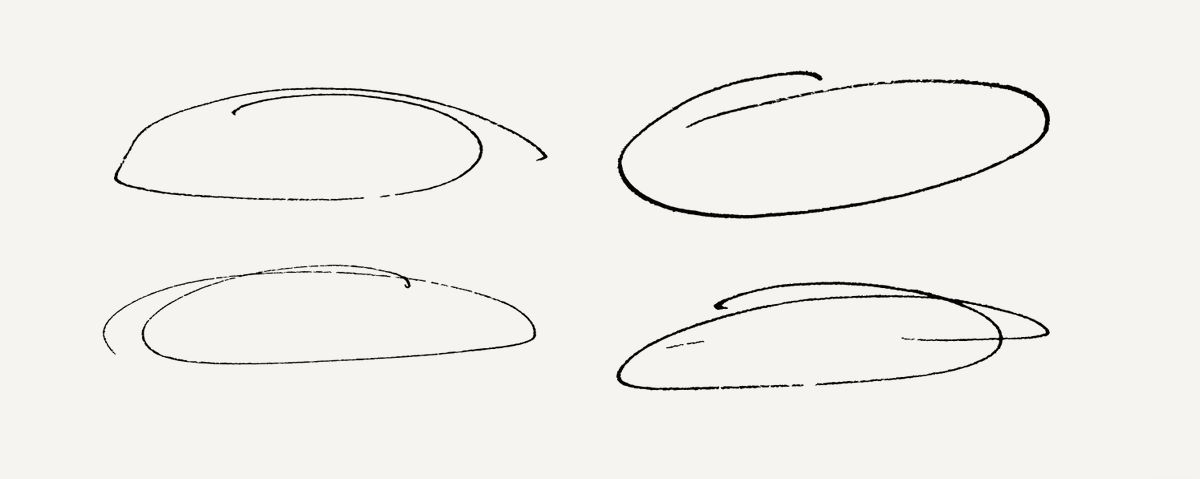
🏔 Tiny update for faculty.com — I was using traced SVG of real pen lines for the nav links hover state, but strokes with animated dashoffset feels way more interactive and cool.
This is kinda minutiae but I like sharing micro-updates cause it's easier to do short-form technical writing on a micro scale than macro lol
Me doing "short-form technical writing":
This button is more weblike and coolish feely

