update. swapping to a light theme, dropping the busy line art, using tighter type, and letting some of the cover art color come through seems like it's pulling everything together a bit better. 404boyfriend/1461893073198272514
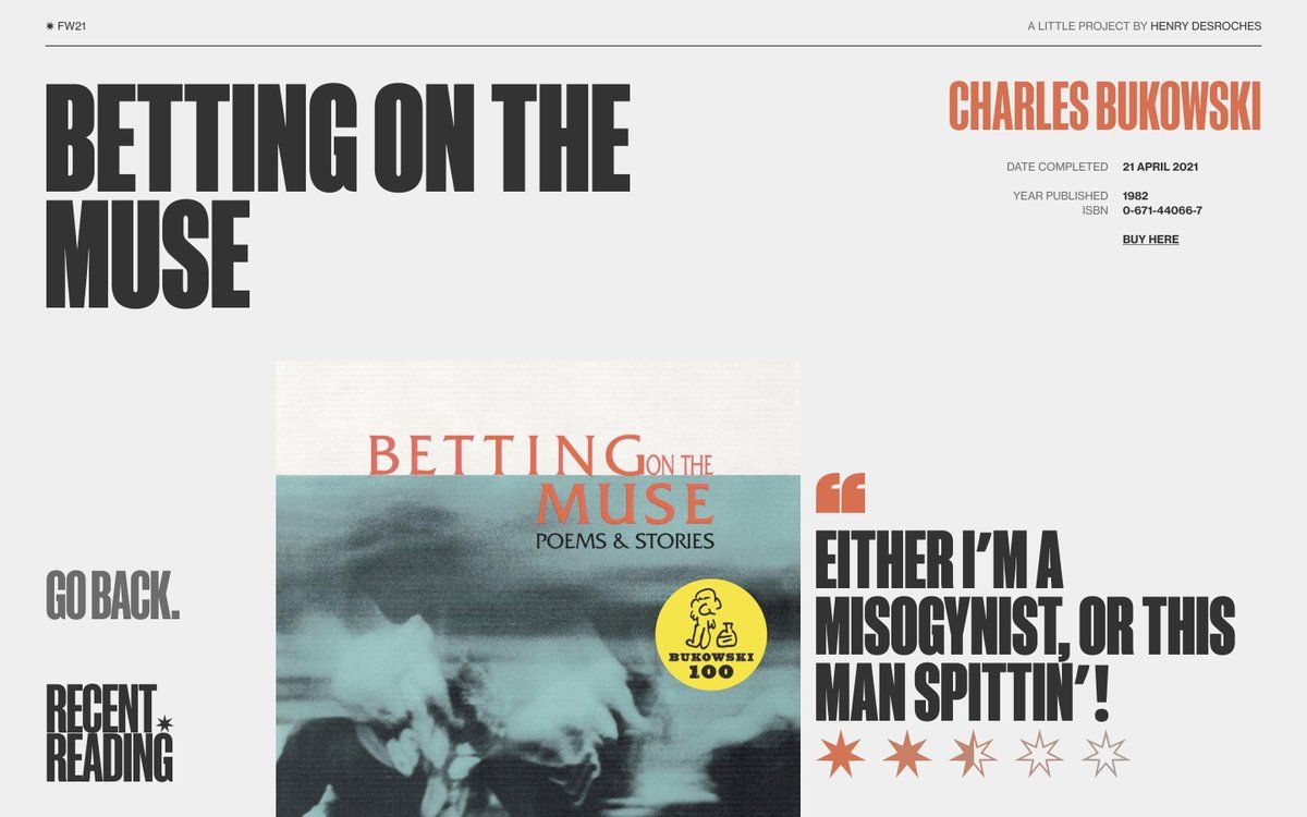
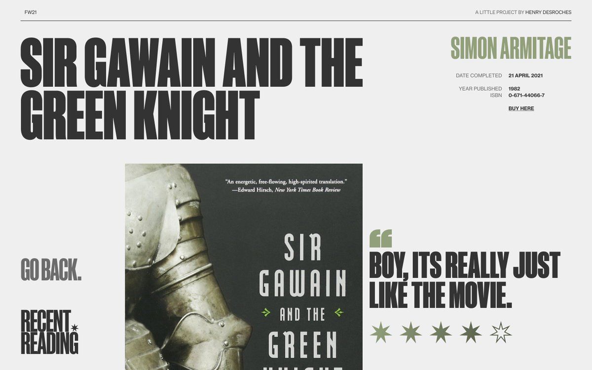
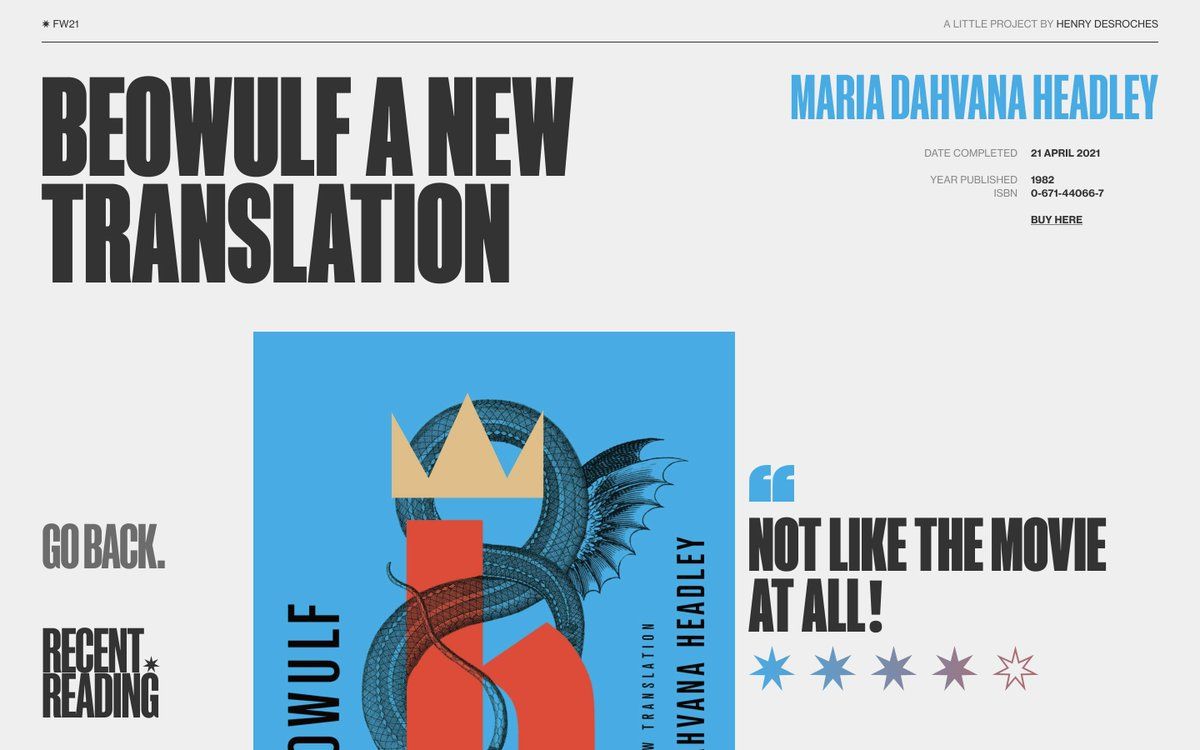
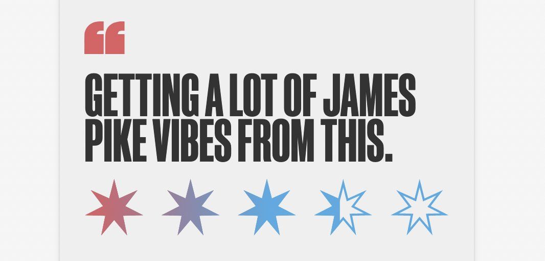
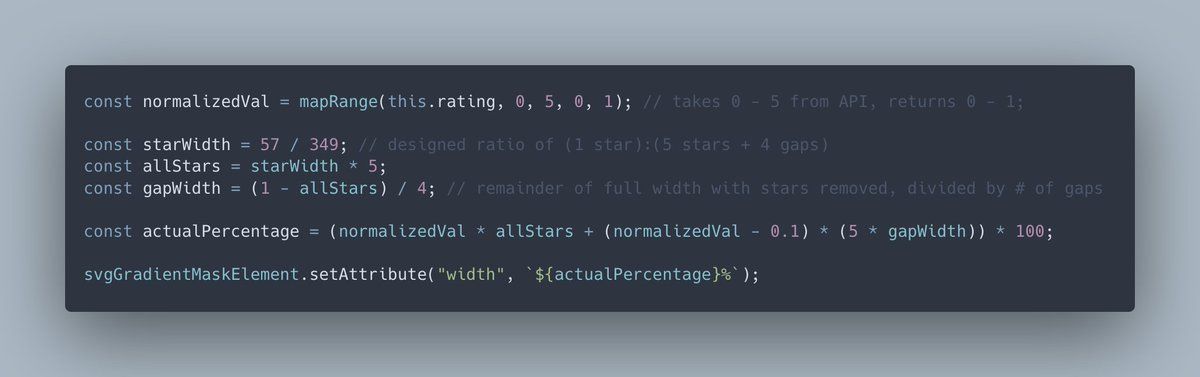
made the mistake of designing a half-star rating component around an SVG <linearGradient> mask with space between stars — but it means that something like 3.5/5, or 70%, doesn't map perfectly to masking 70% of the width of the whole shape...
so I just spent this evening debugging with my sister the math required to procedurally account for the gaps given only the ratio of 1 star to 5 stars + 4 gaps lol. 😵💫
fwiw, here's where we ended up. it's actually still not perfect (0 returns a negative 2% and 1 returns 102%), but it's visually perfect in all other cases, and i'm tired :) i just put a clamp function in the final implementation lmao
gist.github.com/xdesro/d88e3ea00b2aaef9cd022598d40926c8
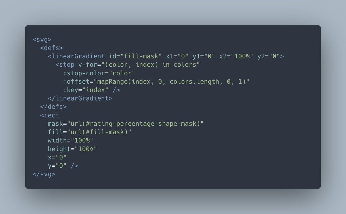
something else: for each page, the theme can take anywhere from 1 to n colors, and should create a smooth SVG gradient for the stars with those colors. here's how i'm handling that with a <linearGradient> primitive (using server-side vue for template interpolation in an 11ty app)