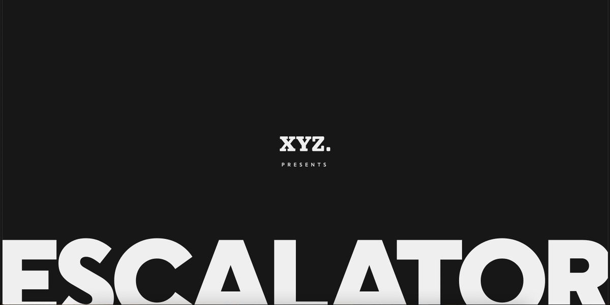
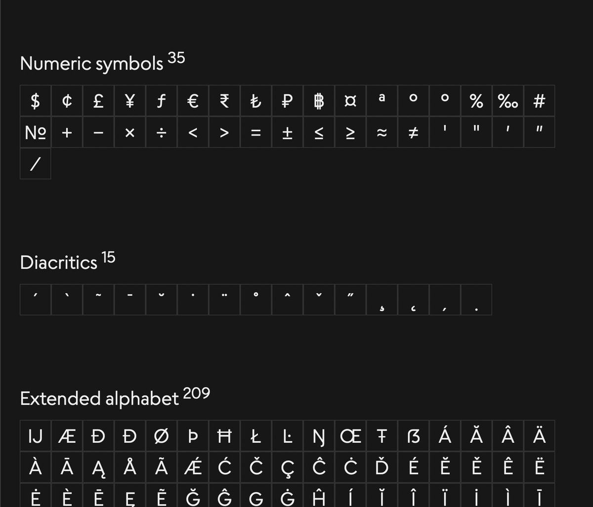
this was such a lovely project, one of my last with the esteemed team at Faculty. got to build some really fun interactivity, I literally adore working with type shops, and XYZ was a fantastic collaborator.
geometricsans.com/ xyz_type/1471483589585944583
the best part of any type microsite is getting to play with the fonts right out of the gate — I created this reusable content component we could rapidly scaffold the page content with while allowing users to get weird with the variable properties, everything content-editable.
we needed a way to show the differences in personality between Escalator and Elevator, so I put together this component that used the Bézier data of each glyph and some CSS mix-blend-modes to demonstrate those differences. really stands out on the Q, W and S glyphs.
I think it's fun and nice to represent the axes of a variable font as actual axes, so we created this element that lets you play with the optical size and weight of both font faces.
all in all, i'm super stoked on how this turned out with an incredibly quick timeline. XYZ is doing some fantastic work with these fonts and I'm so honored they trusted me and the Faculty team with this project 💛
geometricsans.com/


